


This article's focus is on the common need for both developers and clients for responsive images on their websites, not just for image fields but for responsive inline images within text.
This tutorial assumes you have more than enough experience to setup wysiwyg and are familiar with why breakpoints are being used to deliver images which vary depending on the viewer’s screen width, so I won’t go through every detail. If you want to learn more about how the HTML5 picture element does its thing, you can read more here.
There are two parts described here: Part 1 explains how to use the Picture module for images selected as a field. Even if you don't need that, setting up the breakpoints and image styles is necessary for Part 2 where the insertion of responsive images within a text body is covered.
The environment and files:
- Drupal 7.36 or a greater 7.x version.
- Picture module (recommended release 7.x-2.11 or higher), which relies on:
- Breakpoints module (recommended release 7.x-1.3 or higher)
- Ctools module (recommended release 7.x-1.7 or higher)
- Library module (recommended release 7.x-2.2 or higher)
- Wysiwyg module. In this tutorial we're going to use the dev (7.x-2.2+63-dev) version because IE11 doesn’t support the CKEditor 3.x library and we need the dev version of wysiwyg to use the CKEditor 4.5.1 library. I’m loathe to use dev modules, but note that if you prefer to use the stable release of the wysiwyg module, you can use TinyMCE which works with IE11 but isn't as slick of a user experience as CKE 4. Be sure to lock this module with Drush to prevent update to the older 7-x-2.2 version by using
drush up -n --lock=wysiwyg- CKEditor 4.5.1 library. The link here is for the Full package of the 4.5.1 library. The standard one is not compatible with the dev version of wysiwyg just yet.
Enable all of these modules and install the ckeditor library into your /sites/all/libraries directory. Since we’re altering the .info file of a theme, to keep things simple, I’ve made a copy of the core Bartik theme (calling it bartik2 in the .info and template.php files) and put it into my themes directory as the default theme.
Part 1 – Setting up the Picture Module for Image Fields:
- To use the Picture module, you’ll need to alter your .info file on your front-end theme and add the following at the bottom:
; For Picture 2.x

breakpoints[tv] = only screen and (min-width: 3456px)
breakpoints[wide] = (min-width: 851px)
breakpoints[narrow] = (min-width: 560px)
breakpoints[mobile] = (min-width: 0px)
- Text Formats – in admin/config/content/formats make certain you have the allowed tags for your Filtered HTML format, so have at least:
<img> <span>in there. - In Appearance, click on the ‘Settings’, scroll to the bottom and and you should see a ‘Scan this theme for breakpoints’ button. Click on that and With the breakpoints configured in your theme’s info file and the theme enabled, you will get a message: “The breakpoints from theme (name) are imported and a new group is created.”. You should see a list of the options you specified in your info file.
- If you now go to: admin/config/media/breakpoints and select the name of your theme from the top right subtabs, you should see the breakpoints you defined.
- Add new styles for breakpoints. This section will be based on the Images Styles that come default with Drupal. If you want to create your own custom names for styles, do that first and make sure to clear the cache before proceeding. Otherwise, we’ll stick with defaults.
- In the upper right hand, you’ll see a main tab for ‘Add Responsive Style’. Click there.
- We’re going to now define image sizes for three breakpoints, namely: wide, narrow, mobile. Deselect ‘Empty srcset’ and ‘tv’ unless you plan on using those.
- Large style sets made at admin/config/media/breakpoints/create_style
- In the ‘Image style’ dropdown, select Large
- In the ‘Image style base name’ enter: "large_" as the prefix and click the Create button. What this does is create a set of 3 large image styles for wide screens, narrow and mobile. You’ll want to edit the size of each of these to suit your needs.

You actual setting will ultimately depend on how wide your content area is but for example, you could use: - large_breakpoints_theme_[your-theme]_wide_1x -- set to 650 x 650.
- large_breakpoints_theme_[your-theme]_narrow_1x -- set to 500 x 500
- large_breakpoints_theme_[your-theme]_mobile_1x -- set to 350 x 350
- And you want to repeat the steps outlined in 'c' above for med and maybe thumb images if you're using those. The dimensions above are very simplified, and you’ll likely need to adjust the sizes to suit your theme but hopefully this gives you a glimpse into what’s coming in the next few steps.
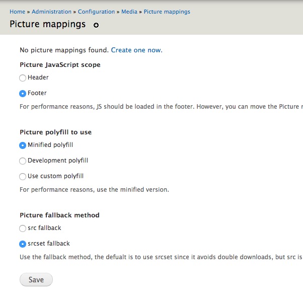
- Associate a Picture Mapping with these styles. Go to: admin/config/media/picture/settings and if you see at the top ‘No picture mappings found. Create one now’, then click on that link.
- From the Breakpoint Group dropdown, select your theme and click ‘Continue’.
- Assign a descriptive admin title for the size it corresponds to. For example, I’m calling mine ‘bartik2-mapping-large’. You’ll see this later in the dropdown on the Manage Display page for images.
- For each section below, select the radio button ‘Use image styles’ for each section that you want to use and in the Image style dropdown, select the corresponding style you created.

When you save this screen, use the ADD button to create mappings for your two other sizes, narrow and mobile. This is the last step to creating the mappings.
- To test them, create or edit an Article node which already has an image field associated to it. Add an image to the field that is about 800px or larger or so in size so we can see how it scales. (note we haven’t yet covered the wysiwyg part yet, which is Part 2 below.)
- Go to the Article’s Manage Display page at admin/structure/types/manage/article/display and for the Image field, select the format of Picture, choosing one of the 3 main mappings you created. (You can leave the settings for this as default, as pictured below, or you can adjust the picture to link to the node, for example).

- Finally, go view your node as it looks on the front-end and scale your browser window down in width. You should see the image change to 3 different sizes as the browser window becomes more narrow. That is the magic of the Picture module in action. The idea here is to save on bandwidth and only load the image that is necessary since you don’t want to subject mobile users to downloading huge images if they don’t really need them.


Part 2 – Setting up the WYSIWYG for Inline Responsive Images
- wysiwyg module – Some tutorials online talk about the CKEditor module but this also works with the arguably simpler wysiwyg module and the CKEditor library. I’m going to use the Filtered HTML for demonstration purposes, so enable CKEditor 4.5.1 for that Text Format and select at least the ‘Responsive Images with the Picture Module’ and the ‘Image’ checkboxes. (make certain you have the allowed tags for your Filtered HTML Text Format, so have at least:
<img> <span>in there).- Note: If you want to use IMCE to browse your images, install that along with imce_wysiwyg module for extra flexibility. See this article on how to combine file management of imce and the file field.
- In the Text Format configure screen, make sure to enable the ‘Make images responsive with the picture module’ and position it below ‘Convert link breaks into HTML’ as pictured here.

- Go to: admin/config/media/picture/settings and enable the ‘Include [your-theme] [your mapping name] in the CKEditor image dialogue’ in each box representing the picture mappings you created in Part 1. If you don’t do this, you won’t get a pop-up for the image button in the wysiwyg toolbar.
- Now, go create a new Article node and in your toolbar, you’ll see an image button. Note in the screenshot I have IMCE and IMCE WYSIWYG installed so I can easily select an image from my files directory. How you get an image into the text area is not essential - perhaps you used the Insert module, but nevertheless the important thing is that you click on an image in the text area.
- Note the ‘Image size (required)’ dropdown on the image pop-up. You’ll want to choose your mapping you created earlier. Insert your picture into the text body.

- Finally, view your node and decrease your browser width to see the magic of a responsive inline image! The images scale and they are actually different images and not the resizing of the same image.The nice thing is that the Picture module also comes with some basic css to allow images to float, but you can always enhance this with margins, etc in your own stylesheet.


Again, be sure to lock the wysiwyg module with Drush to prevent update to the older 7-x-2.2 version by using drush up -n --lock=wysiwyg
Celebrate! Now take this knowledge and extrapolate on how to apply this to other styles for your images.